
We at Embarcadero continue to consider the VCL as the best library for Windows-specific GUI development and are continuing the effort of improving and modernizing it, particularly improving the overall support for Windows 10. One of the directions of this effort (along side with styling, WinRT API, Desktop Bridge and more) is the addition of new VCL controls with the look of feel of the latest Windows platform controls, part of the WinRT UI layer. We have already delivered similar controls in 10 Seattle and 10.1 Berlin, and now adding 2 more in this release.
The goal od this control is to offer a more modern UI for VCL applications, adopting the Windows 10 UI style and elements without forcing you to rewrite the entire application (as someone in Redmond suggests) and allowing you to build programs that will still work fine and look great on Windows 7 -- a version of Windows still largely used today.
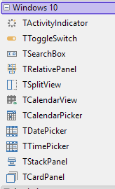
This is the reason why this family of controls is a set of pure VCL controls, that mimic the WinRT controls with no WinRT dependency. You can see the current list in the image below. Of these 4 controls are new in 10.2.2 Tokyo, the two pickers I'm covering in this blog post and two additional container panels I'll cover in a separate post.
As the name implies, the Date Picker and Time Picker components offers a simple, intuitive, and modern way to select a date or a time. These components are highly configurable, and can be adapted to any locale and format -- as these are quite different depending on where people live.
TDatePicker
The date selection component both displays a date in a given format and offers the user a simple way to select a date value from a dropdown. Rather than displaying a calendar, the user can change the day, month, and year values separately, similarly to what happens in most mobile platforms and applications. The user can change the selection with the keyboard arrow keys, clicking with the mouse on the upper or lower elements of a list or on the top and bottom arrows, or using the mouse wheel.
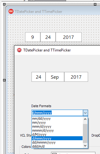
The key property of the component is the DateFormat property. This allows you to establish the format in which you want to display the date, changing the sequence in which the control displays the elements (month/day/year vs. day/month/year, vs year/month/day, etc.). This affects both the initial display and the actual selection. Below you can see a couple of different configurations, one at design time above and one at runtime. You can also see in the drop down a list of sample configurations, including month names or numbers, one or two digit days, and so on. The image is from the DateTimePickers sample that ships with RAD Studio 10.2.2 in the VCL section of the demos.
More information about the component is available in the RAD Studio DocWiki at http://docwiki.embarcadero.com/RADStudio/Tokyo/en/Using_the_Date_Picker_Control.
TTimePicker
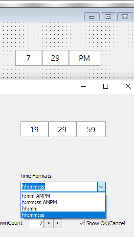
The time selection component is very similar to the date selection. Again it has multiple sections for the hour, the minute, possibly the seconds, and possibly the AM/PM selector. In this case the fundamental property is the TimeFormat property. Again, it determines both the display and the pickers behavior. You can include seconds or exclude hours and add AMPM to the time format to use a 12 hours format and to include an AM / PM selector to the dropdown.
Again, here is an example with a couple of different settings (at design time and runtime) with an image taken from the same demo mentioned above.
Additional documentation is at http://docwiki.embarcadero.com/RADStudio/Tokyo/en/Using_the_Time_Picker_Control.
That's all for now. Stay tuned for info on the other two new VCL controls in 10.2.2, or join the intro webinar tomorrow.