
With the need to support more screen resolutions, while creating nice looking user interfaces and pleasant user experiences, we think it is important to offer additional ways to build the UI of your VCL applications. This is why in 10.2.2 we introduced two new VCL panel controls. These are control containers with specific way to manage the layout and position of their child controls. You can see the controls at design time below:
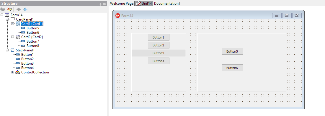
TCardPanel
The CardPanel control is a set of pages, like the old PageControl, with no tabs. You display one page at a time, and it has built in support for swiping pages using a gesture. It is a collection of panels of the same size, each hosting its own controls.
At design time, you can use the local menu to add a card or select one, as shown here (image courtesy of RAD Studio DocWiki):
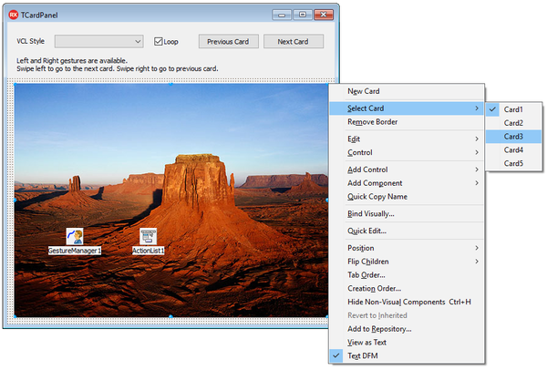
Each page is a "TCard" object, which is just a regular panel in disguise, so no special properties of configuration. More information at http://docwiki.embarcadero.com/RADStudio/Tokyo/en/Using_the_Card_Panel_Component
TStackPanel
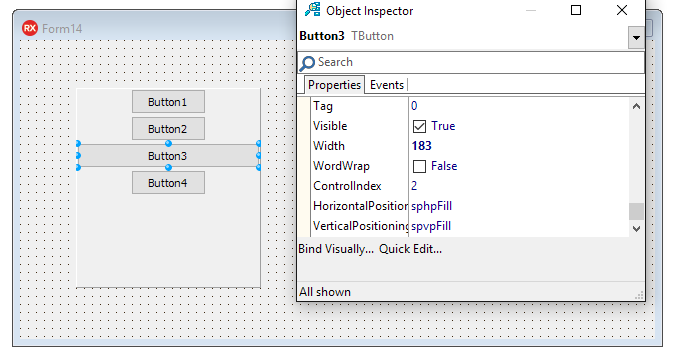
The stack panel is a panel with a special layout. All controls added to it are placed in a different "row" (or column if you set it horizontally). The controls can be aligned to the left, the right, the center or use the entire space (fill). You set the default alignment at the stack panel level, and you can override it for each individual control (or use the special default value to pick the parent control setting). Each of the controls hosted by the panel, gets three additional properties "injected" by the container -- at the bottom of the Object Inspector list -- as you can see below:
More information at http://docwiki.embarcadero.com/RADStudio/Tokyo/en/Using_the_Stack_Panel_Component
The VCL remains a central pillar of Delphi (and C++Builder), and Embarcadero is and will continue to enhance it matching the evolution of the Windows platform and user experience, while on the other hand ensuring a very high degree of compatibility with the existing VCL code.